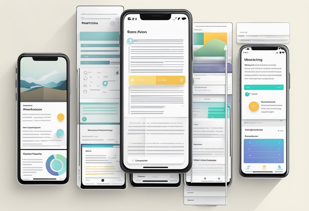
React Native Paper is a UI library for React Native applications. It provides a set of customizable components that follow the Material Design guidelines. These components can be used to build beautiful and responsive user interfaces for both iOS and Android platforms.
React Native Paper is built on top of React Native’s core components, which means that it is easy to integrate into existing React Native projects. It also provides a theming system that allows developers to customize the look and feel of their applications. This theming system is based on the Material Design color palette, which makes it easy to create consistent and visually appealing designs.
One of the main benefits of React Native Paper is that it saves developers time and effort by providing pre-built components that are ready to use. This means that developers can focus on building the logic of their applications rather than spending time on designing and implementing UI components. Additionally, React Native Paper is an open-source library, which means that developers can contribute to its development and improve it over time.
Getting Started
React Native Paper is a UI library for React Native that provides ready-to-use components for building beautiful and responsive mobile applications. In this section, we will explore how to get started with React Native Paper.
Installation
Before you can start using React Native Paper, you need to install it in your project. You can do this using npm or yarn by running the following command in your project directory:
npm install react-native-paper
or
yarn add react-native-paper
After installation, you need to link the library to your project by running the following command:
react-native link react-native-paper
Basic Usage
To use React Native Paper components in your project, you need to import them from the library and render them in your code. Here’s an example of how to use the Button component:
import React from 'react';
import { Button } from 'react-native-paper';

const MyComponent = () => (
  <Button mode="contained" onPress={() => console.log('Pressed')}>
    Press me
  </Button>
);

export default MyComponent;
In this example, we imported the Button component from React Native Paper and rendered it in our MyComponent component. We also added a mode prop to set the button style and an onPress prop to handle the button press event.
React Native Paper provides many other components that you can use in your project, such as Card, TextInput, Checkbox, and more. You can find a full list of components and their documentation on the official website.
Core Components
React Native Paper provides a wide range of core components that can be used to build beautiful and functional mobile applications. These components are designed to be easy to use and customizable, allowing developers to create unique and engaging user interfaces.
Button
The Button component is a simple and versatile component that can be used to create various types of buttons. It supports different styles, sizes, and colors, making it suitable for different use cases. The Button component also supports icons and loading indicators, which can be used to provide additional functionality and feedback to the user.
Card
The Card component is a versatile component that can be used to create various types of cards, such as product cards, profile cards, and more. It supports different styles, sizes, and layouts, making it suitable for different use cases. The Card component also supports images, titles, subtitles, and actions, which can be used to provide additional information and functionality to the user.
Avatar
The Avatar component is a simple and useful component that can be used to display user avatars, profile pictures, and more. It supports different sizes and shapes, making it suitable for different use cases. The Avatar component also supports images and letters, which can be used to provide a fallback in case an image is not available.
Overall, these core components are essential building blocks for any React Native Paper application. They are easy to use, customizable, and provide a great user experience.
Theming
React Native Paper provides a theming system that allows developers to customize the look and feel of their app. This section will cover the default theme and how to customize it.
Default Theme
The default theme of React Native Paper is designed to be easy on the eyes and provide a consistent look and feel across different platforms. It uses a neutral color palette with shades of gray, black, and white. The default font is Roboto, which is a popular font for mobile apps.
The default theme can be easily applied to components by wrapping them in a Provider component. This will automatically apply the default theme to all child components. For example:
import React from 'react';
import { Provider } from 'react-native-paper';

export default function App() {
  return (
    <Provider>
      {/* Your app code here */}
    </Provider>
  );
}
Customization
Developers can customize the default theme by creating a new theme object and passing it to the Provider component. The theme object can be used to override any of the default values, such as colors, fonts, and spacing.
import React from 'react';
import { Provider, DefaultTheme } from 'react-native-paper';

const theme = {
  ...DefaultTheme,
  colors: {
    ...DefaultTheme.colors,
    primary: 'blue',
    accent: 'green',
  },
};

export default function App() {
  return (
    <Provider theme={theme}>
      {/* Your app code here */}
    </Provider>
  );
}
In the example above, the primary color has been changed to blue and the accent color has been changed to green. The ...DefaultTheme syntax is used to copy all of the default values into the new theme object, so that only the values that need to be changed have to be specified.
Overall, the theming system in React Native Paper provides a simple and flexible way to customize the look and feel of mobile apps. With the ability to create custom themes, developers can create unique and branded experiences for their users.
API Reference
Component API
React Native Paper provides a wide range of customizable components that can be used to build beautiful and responsive user interfaces. These components are designed to follow Material Design guidelines and are easy to use and configure.
Each component has its own set of props that can be used to customize its appearance and behavior. For example, the Button component has props like mode, icon, and onPress that can be used to change its appearance and add functionality.
Other components available in React Native Paper include Card, Checkbox, Dialog, List, Menu, Snackbar, Surface, Switch, TextInput, and Toolbar. These components can be used to build a wide variety of user interfaces, from simple forms to complex dashboards.
Utility Functions
In addition to the component API, React Native Paper also provides a set of utility functions that can be used to style components and create custom themes. These functions include color, typography, mixins, and shadow.
The color function can be used to generate a range of colors based on a primary color, while the typography function can be used to create custom font styles. The mixins function provides a set of helper functions for styling components, and the shadow function can be used to add shadows to components.
React Native Paper also provides a Provider component that can be used to create a custom theme for an entire application. The Provider component takes a theme prop that can be used to customize the appearance of all components in the application.
Overall, React Native Paper provides a comprehensive set of components and utility functions that can be used to build beautiful and responsive user interfaces in React Native.