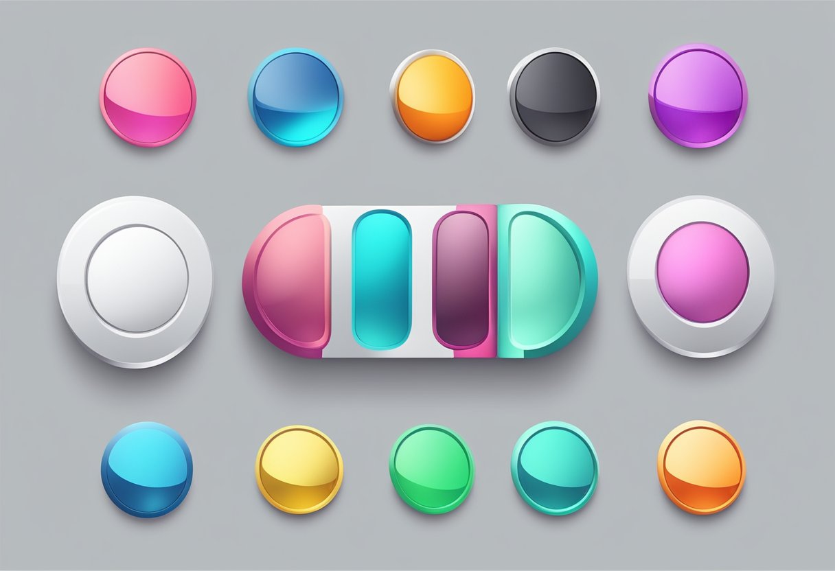
React Native is a popular framework for building mobile applications. One of the essential components of any mobile app is the button. Buttons are used for various actions such as navigating to different screens, submitting forms, and triggering events. In React Native, there are several ways to style buttons, which can affect the overall look and feel of the app.

One way to style buttons in React Native is by using the built-in components such as TouchableOpacity and TouchableHighlight. These components provide basic styling options such as changing the background color, text color, and border radius. However, for more complex designs, developers might need to create their own custom buttons using View and Text components. This approach gives more flexibility in terms of design but requires more coding effort.
In this article, we will explore different ways of styling buttons in React Native. We will cover the built-in components as well as creating custom buttons. Additionally, we will provide examples and best practices for designing buttons that are both aesthetically pleasing and user-friendly.
Índice De Conteúdo
Basic Button Styling in React Native
React Native provides a simple way to create buttons that can be styled to match the look and feel of your app. In this section, we will explore the basics of button styling in React Native.
Setting Up Default Styles
React Native provides default styles for buttons, which can be customized to match your app’s design. These default styles include background color, text color, border radius, and padding.
To set up default styles for buttons, you can use the StyleSheet.create function to define a style object. For example:
import { StyleSheet } from 'react-native';

const styles = StyleSheet.create({
  button: {
    backgroundColor: '#2196F3',
    borderRadius: 5,
    padding: 10,
  },
  text: {
    color: 'white',
    fontWeight: 'bold',
    textAlign: 'center',
  },
});
You can then use these styles in your button component by passing them as props. For example:
import React from 'react';
import { View, Text, TouchableOpacity } from 'react-native';
import styles from './styles';

const Button = ({ title, onPress }) => (
  <TouchableOpacity style={styles.button} onPress={onPress}>
    <Text style={styles.text}>{title}</Text>
  </TouchableOpacity>
);

export default Button;
Inline Styling for Quick Prototyping
In addition to setting up default styles, React Native also allows you to apply styles inline for quick prototyping. This can be useful for testing different styles without having to define a separate style object.
To apply inline styles to a button component, you can use the style prop and pass in a style object. For example:
import React from 'react';
import { View, Text, TouchableOpacity } from 'react-native';

const Button = ({ title, onPress }) => (
  <TouchableOpacity
    style={{
      backgroundColor: '#2196F3',
      borderRadius: 5,
      padding: 10,
    }}
    onPress={onPress}
  >
    <Text style={{ color: 'white', fontWeight: 'bold', textAlign: 'center' }}>
      {title}
    </Text>
  </TouchableOpacity>
);

export default Button;
While inline styling can be useful for quick prototyping, it is generally recommended to use default styles for consistency and maintainability in larger projects.
In conclusion, React Native provides a simple way to style buttons for your app. By setting up default styles and using inline styling for quick prototyping, you can create buttons that match your app’s design and provide a great user experience.
Advanced Button Customization
Using StyleSheet for Optimization
React Native provides the StyleSheet API to optimize the performance of your app. Using StyleSheet for button styling allows you to apply styles to multiple buttons at once, reducing code duplication and improving performance. By defining styles in a separate file, you can easily reuse them throughout your app.
Here’s an example of how to use StyleSheet to style a button:
import React from 'react';
import { StyleSheet, Text, TouchableOpacity } from 'react-native';

const styles = StyleSheet.create({
  button: {
    backgroundColor: '#4CAF50',
    padding: 10,
    borderRadius: 5,
  },
  buttonText: {
    color: '#fff',
    fontSize: 16,
    fontWeight: 'bold',
  },
});

const CustomButton = ({ onPress, title }) => (
  <TouchableOpacity onPress={onPress} style={styles.button}>
    <Text style={styles.buttonText}>{title}</Text>
  </TouchableOpacity>
);

export default CustomButton;
Handling Different States
Buttons can have different states, such as disabled or pressed. React Native provides the ability to handle these states with the Touchable components. By using the TouchableHighlight component, you can change the style of the button when it’s pressed.
Here’s an example of how to handle button states:
import React, { useState } from 'react';
import { StyleSheet, Text, TouchableHighlight, View } from 'react-native';

const styles = StyleSheet.create({
  button: {
    backgroundColor: '#4CAF50',
    padding: 10,
    borderRadius: 5,
  },
  buttonText: {
    color: '#fff',
    fontSize: 16,
    fontWeight: 'bold',
  },
  disabledButton: {
    backgroundColor: '#ccc',
  },
});

const CustomButton = ({ onPress, title, disabled }) => {
  const [isPressed, setIsPressed] = useState(false);

  return (
    <TouchableHighlight
      onPress={onPress}
      underlayColor="#3e8e41"
      style={[
        styles.button,
        isPressed && { backgroundColor: '#3e8e41' },
        disabled && styles.disabledButton,
      ]}
      onHideUnderlay={() => setIsPressed(false)}
      onShowUnderlay={() => setIsPressed(true)}
      disabled={disabled}
    >
      <Text style={styles.buttonText}>{title}</Text>
    </TouchableHighlight>
  );
};

export default CustomButton;
Custom Components for Reusability
Creating custom components is a great way to reuse code and maintain consistency throughout your app. By creating a custom button component, you can easily reuse it in different parts of your app.
Here’s an example of a custom button component:
import React from 'react';
import { StyleSheet, Text, TouchableOpacity } from 'react-native';

const styles = StyleSheet.create({
  button: {
    backgroundColor: '#4CAF50',
    padding: 10,
    borderRadius: 5,
  },
  buttonText: {
    color: '#fff',
    fontSize: 16,
    fontWeight: 'bold',
  },
});

const CustomButton = ({ onPress, title }) => (
  <TouchableOpacity onPress={onPress} style={styles.button}>
    <Text style={styles.buttonText}>{title}</Text>
  </TouchableOpacity>
);

export default CustomButton;
By using the custom button component, you can easily create buttons with the same style and behavior throughout your app:
import React from 'react';
import { View } from 'react-native';
import CustomButton from './CustomButton';

const App = () => (
  <View>
    <CustomButton onPress={() => {}} title="Button 1" />
    <CustomButton onPress={() => {}} title="Button 2" />
    <CustomButton onPress={() => {}} title="Button 3" />
  </View>
);

export default App;
Platform-Specific Styles
React Native provides a way to create platform-specific styles for components, which is useful for ensuring that the user interface looks consistent across different platforms. This is especially important for buttons, which are a key component of any user interface.
Adapting Styles for iOS
When it comes to styling buttons for iOS, there are a few things to keep in mind. First, iOS buttons tend to have rounded corners and a shadow, so it’s a good idea to include these styles in your button component. You can achieve this by using the borderRadius and shadowColor properties.
Another important consideration is the color of the button. iOS buttons typically have a blue color, so you may want to use this color in your button component. You can do this by setting the backgroundColor property to a shade of blue.
Adapting Styles for Android
Android buttons have a different look and feel than iOS buttons, so it’s important to adapt your styles accordingly. One thing to keep in mind is that Android buttons tend to have sharper corners than iOS buttons, so you may want to adjust the borderRadius property accordingly.
Another consideration is the color of the button. Android buttons typically have a more muted color than iOS buttons, so you may want to use a more subdued color in your button component. You can do this by setting the backgroundColor property to a shade of gray or another muted color.
Overall, when it comes to styling buttons in React Native, it’s important to consider the platform-specific styles that are appropriate for each platform. By following these guidelines, you can ensure that your buttons look great on both iOS and Android devices.
Performance Considerations

When it comes to designing buttons in React Native, performance is an important consideration. The way buttons are designed can have a significant impact on the overall performance of the application. Here are a few performance considerations to keep in mind:
1. Avoid Using Images for Buttons
Using images for buttons can be tempting, but it can also have a negative impact on the performance of the application. Images take up more memory and require more processing power than other types of buttons. Instead, it is recommended to use built-in components such as TouchableOpacity or TouchableHighlight to create buttons.
2. Use Stylesheets to Optimize Button Styling
Styling buttons in React Native can be done using inline styles or stylesheets. Using stylesheets is recommended as it helps to optimize the performance of the application. Stylesheets are cached by the system, which means that the styles are only loaded once and can be reused throughout the application. This helps to reduce the amount of processing power required to render the buttons.
3. Keep Button Animations Simple
Animations can add a lot of visual flair to buttons, but they can also have a negative impact on the performance of the application. Complex animations require more processing power and can cause the application to slow down. It is recommended to keep button animations simple and use built-in animations such as the Animated API to create simple and efficient animations.
By keeping these performance considerations in mind, developers can create efficient and optimized button designs in React Native.

