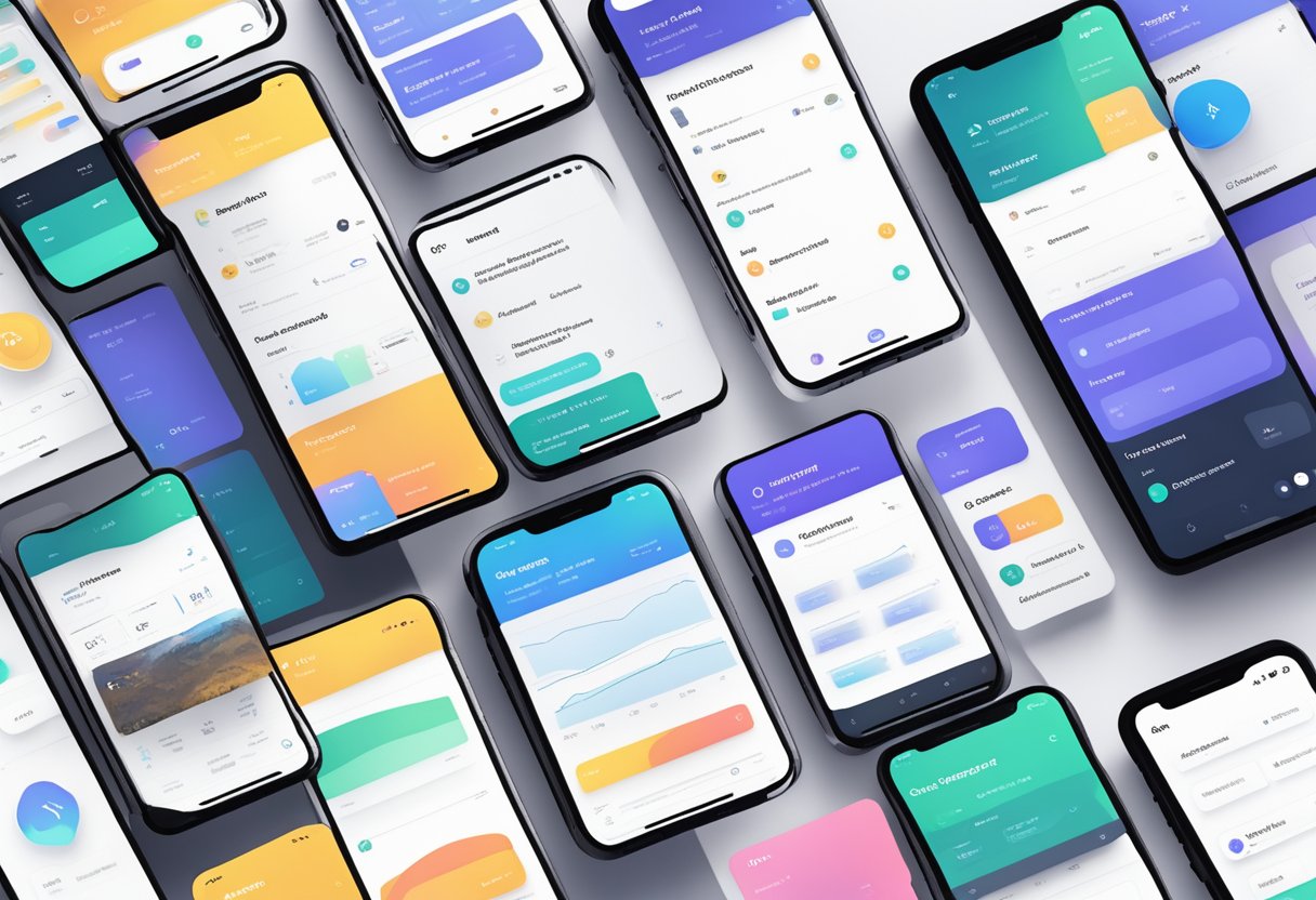
Building a Design System with React Native: Enforcing Consistency and Style
Design systems are a collection of reusable components, guidelines, and assets that are used to build consistent, scalable, and efficient user interfaces. They help teams to work faster, reduce inconsistencies, and improve the overall quality of the product. React Native is a popular framework for building cross-platform mobile applications. It allows developers to write code once and deploy it on both iOS and Android platforms.
In this article, we will discuss how to build a design system with React Native. We will explore the benefits of using a design system, the key components of a design system, and how to enforce consistency and style across your application. We will also provide practical examples and code snippets to help you get started with building your own design system. By the end of this article, you will have a clear understanding of how to create a scalable and efficient design system for your React Native applications.
Fundamentals of a Design System
A design system is a collection of reusable components, guidelines, and assets that help teams build consistent and cohesive interfaces. A well-designed system can improve the efficiency of the design and development process, enhance the user experience, and reduce the time and cost of creating new products.
Defining Design Tokens
Design tokens are the atomic elements of a design system. They are the variables that define the visual and functional properties of a component, such as color, typography, spacing, and layout. By defining these tokens, designers and developers can ensure consistency and coherence across the system.
Design tokens can be defined in various formats, such as JSON, YAML, or CSS variables. They can also be organized into categories, such as colors, typography, spacing, and layout. By establishing a clear and consistent naming convention for these tokens, teams can easily reference and reuse them throughout the system.
Establishing a Visual Language
A visual language is a set of design principles and patterns that define the look and feel of a product. It includes elements such as color, typography, iconography, imagery, and motion. By establishing a consistent visual language, teams can create a cohesive and recognizable brand identity, as well as improve the usability and accessibility of the interface.
To establish a visual language, teams should consider the brand values, target audience, and product goals. They should also research and analyze existing design trends and best practices. By creating mood boards, style guides, and design systems, teams can document and communicate the visual language to stakeholders and collaborators.
Component Architecture
Component architecture is the structure and hierarchy of the components in a design system. It defines how the components are organized, named, and grouped, as well as how they interact with each other and with the data. By establishing a clear and scalable component architecture, teams can improve the maintainability and extensibility of the system.
To create a component architecture, teams should consider the functional and visual requirements of the product, as well as the patterns and conventions of the platform and technology. They should also design for flexibility and reusability, by breaking down complex components into smaller and simpler ones, and by using composition and inheritance to share functionality and styles.
Implementation Strategies
Setting Up the Development Environment
Before starting to build a design system with React Native, it is essential to set up the development environment correctly. This involves installing the necessary tools and dependencies, such as Node.js and React Native CLI. Additionally, developers can use third-party libraries like Storybook to create a UI component library, which allows for easy visualization and testing of components.
Creating Reusable Components
The key to building a successful design system is creating reusable components. These components should be modular and easy to use across different projects. Developers can create a library of UI components that can be easily reused and customized to fit different design needs. Using props and state management, developers can create dynamic components that can adapt to different use cases.
Styling and Theming
Consistency in styling is crucial when building a design system. Developers can use a combination of CSS and inline styles to create a consistent look and feel across different components. Additionally, using a theming system allows for easy customization of the design system to fit different branding needs. Developers can use libraries like styled-components to create a robust theming system.
Documentation and Adoption
To ensure the successful adoption of the design system, it is essential to provide clear documentation and guidelines. This includes documentation on how to use the different components and how to customize the theming. Developers can use tools like React Styleguidist to automatically generate documentation for the UI component library. Additionally, providing training and support to the development team can help ensure the successful adoption of the design system.
Overall, building a design system with React Native requires careful planning and execution. By following these implementation strategies, developers can create a robust and consistent design system that can be easily adopted across different projects.